
Allister Peabody
Responsive Website Design
Project Overview
This case study details the redesign of the website for Allister Peabody, foundation advocating for K-12 education reform. The existing website offered limited visual impact and lacked a clear call to action. This redesign aimed to create a more engaging and informative platform that reflects the foundation’s mission.
Tools


Team
Independent
Role
Lead Graphic Designer
Duration
October 2024


The Problem
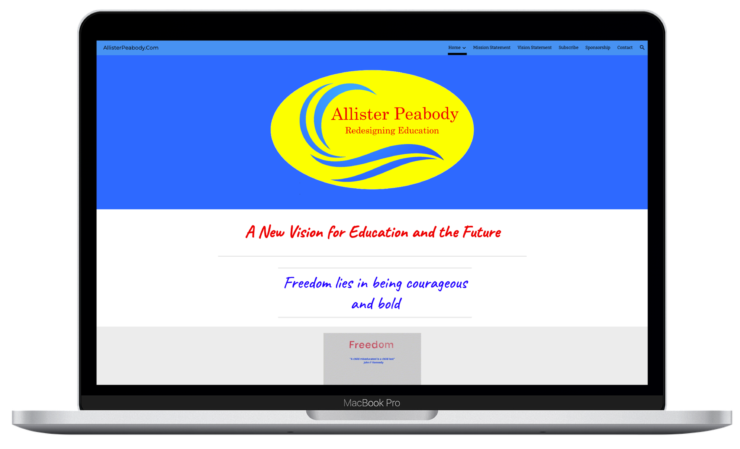
The foundation was very set on their existing website, logo, and color palette. They needed guidance on creating a more optimal user experience while not completely changing the existing logo and colors. The existing website felt stagnant and lacked a strong visual identity. The logo and color palette was outdated and visually unappealing. The information was presented in a dry and text-heavy way, diminishing user engagement and making the user feel overwhelmed. The key part that was missing was a clear call to action that encourages users to support the initiatives.
The existing Allister Peabody website lacked a visually engaging design, presented information in a text-heavy format, and failed to motivate users to take action.
Before

My Role
Graphic Designer
I was responsible for conducting visual research and developing a brand identity that aligns with the Allister Peabody mission and vision statements. This included designing a user-friendly, responsive website layout with strong visual hierarchy. And creating compelling visuals to showcase the impact of education reform, while not distracting from the information being presented.
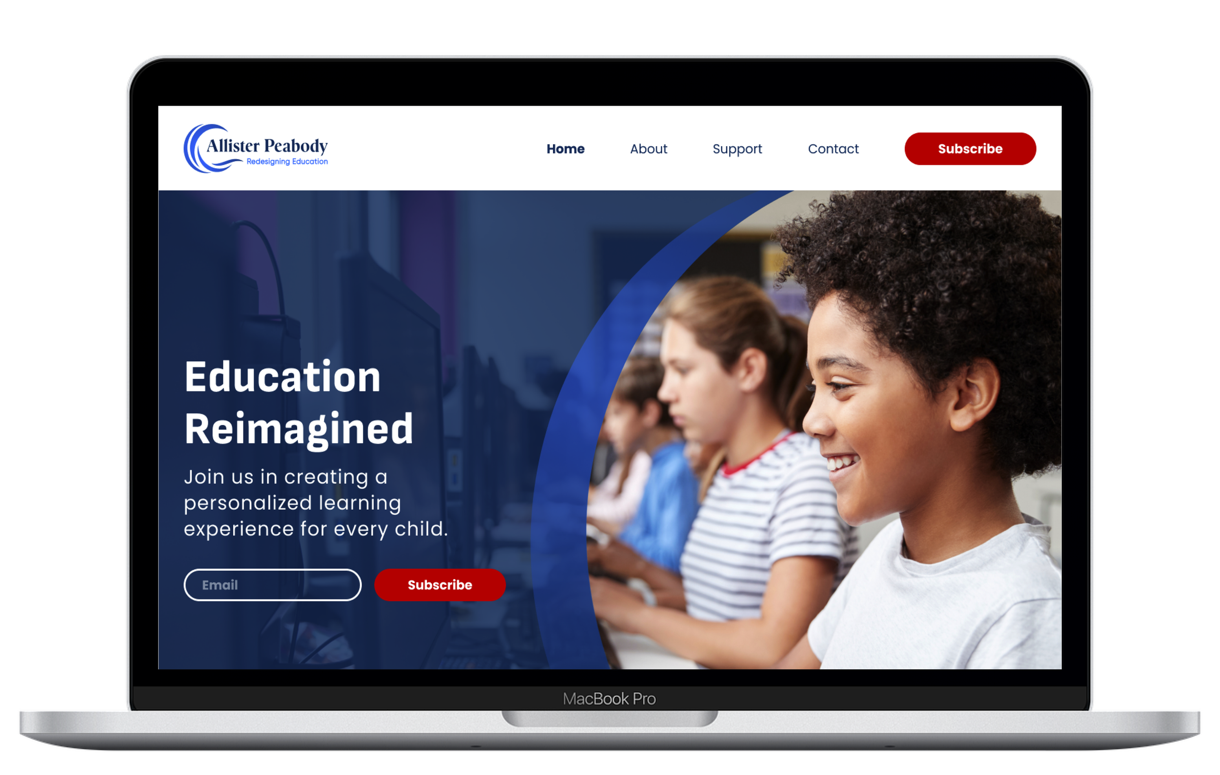
After

The design process included research, reworking the messaging with Google Gemini, brand identity development, information architecture, visual design, and usability testing.
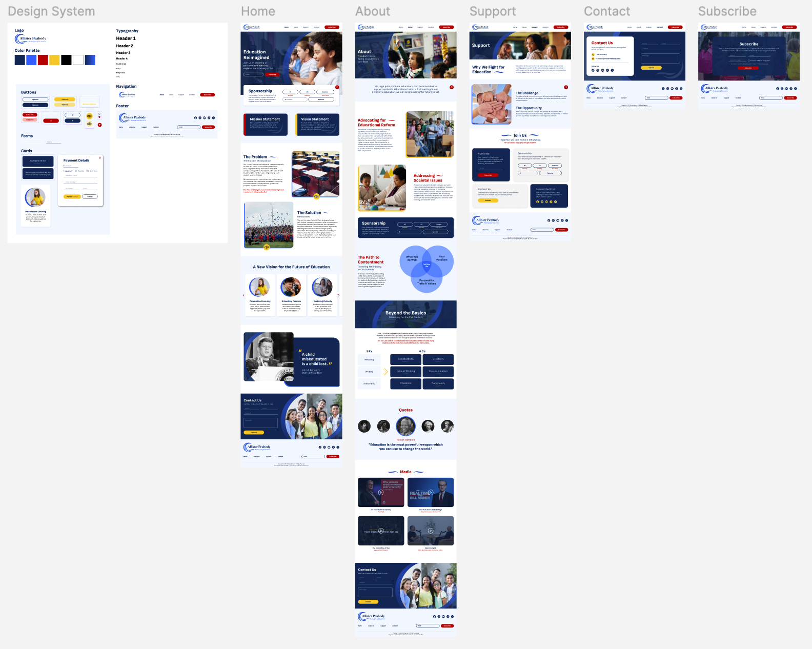
Process
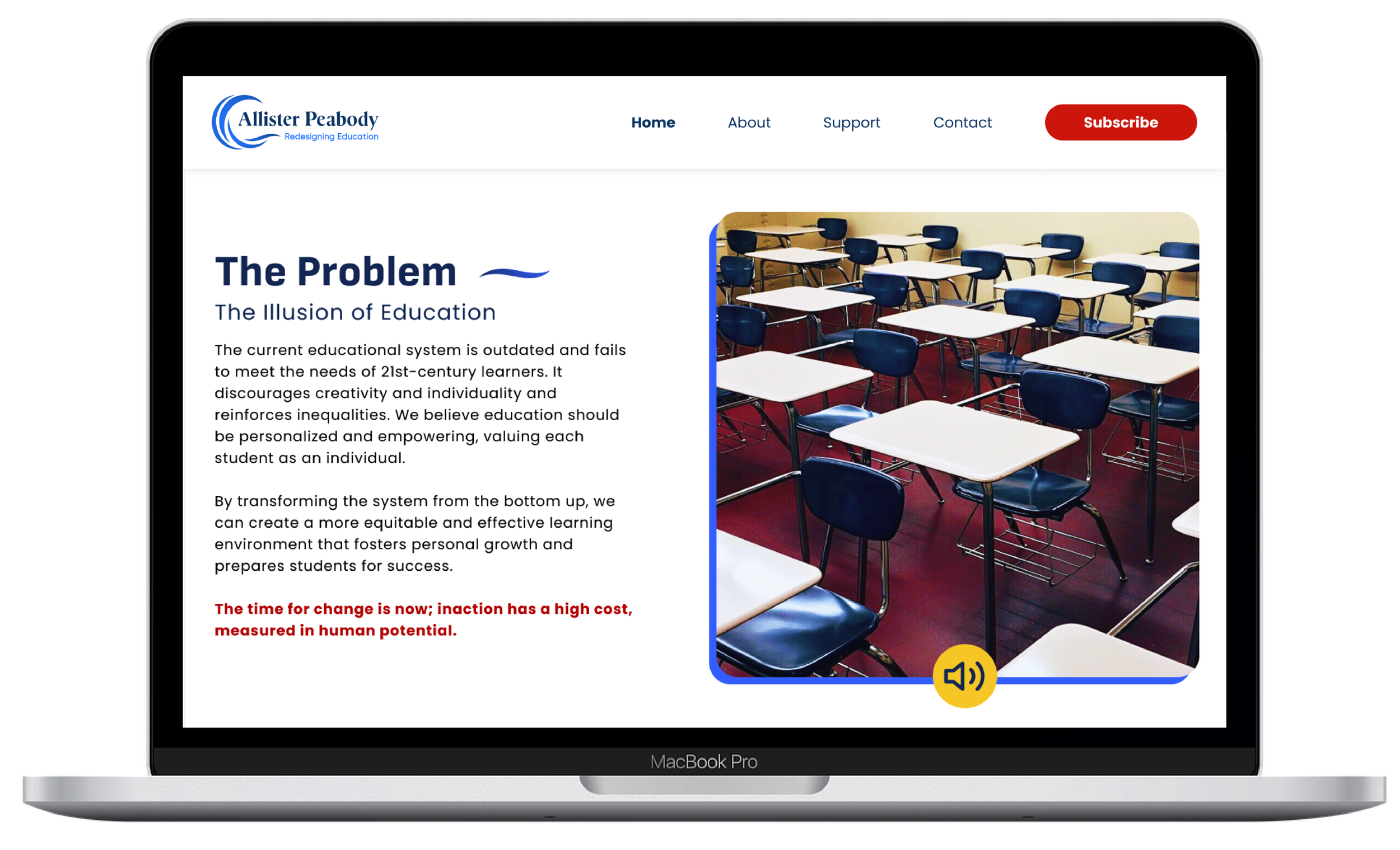
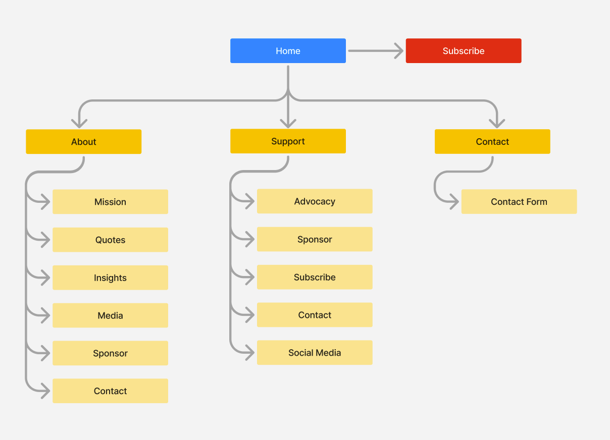
The design process began with getting a basic understanding of what the current website was trying to advocate for. From there I conducted research on the reform goals and the current state of the K-12 education system. Based on this analysis I decided the messaging and visual direction needed a refresh. A brand identity was developed, including a logo, color palette, and typography. The design aimed to convey a sense of trust, innovation, and optimism for the future of education. The next step was reorganizing the website structure to prioritize key information and make the website more user friendly. This included data visualizations, photographs of students engaged in learning, and inspiring quotes. And finally the website prototype was tested with potential users to gather feedback on clarity, user experience, and call to action effectiveness.


The Solution
The redesigned website presents a modern and engaging platform that conveys the mission of the foundation and encourages users to take action and support their efforts.
The consistent brand identity creates a sense of professionalism and trust. The navigation is clear and intuitive, allowing users to easily find the information they need. Engaging visuals draw users in and effectively communicate the impact of Allister Peabody. A prominent call to action encourages users to get involved and support education reform.

Click on a device to view prototype

Aligning the design with the mission for Allister Peabody was crucial for creating a website that truly resonates with the audience. Although they were initially against adding imagery, compelling visuals can effectively communicate complex information and inspire action while not distracting from the messaging. Testing with potential users helps ensure the website delivers a positive user experience and achieves its goals. This project demonstrates my ability to translate complex ideas into clear and visually engaging communication. By utilizing effective design principles and user-centered practices, I successfully created a website that supports efforts to reform the K-12 education system.
The importance of keeping the client in mind when refreshing their branding and website.