Boss Magazine
Digital Design
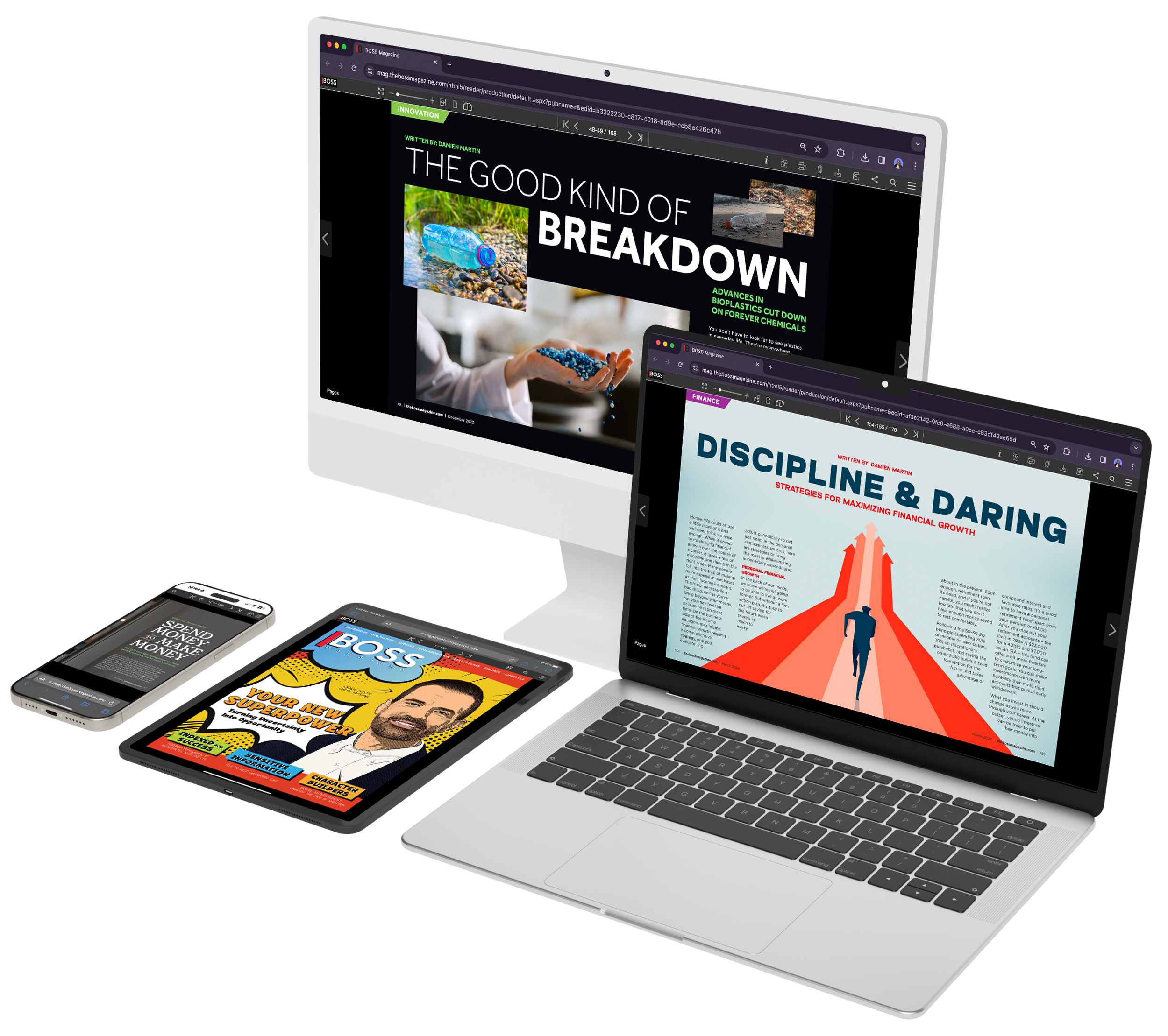
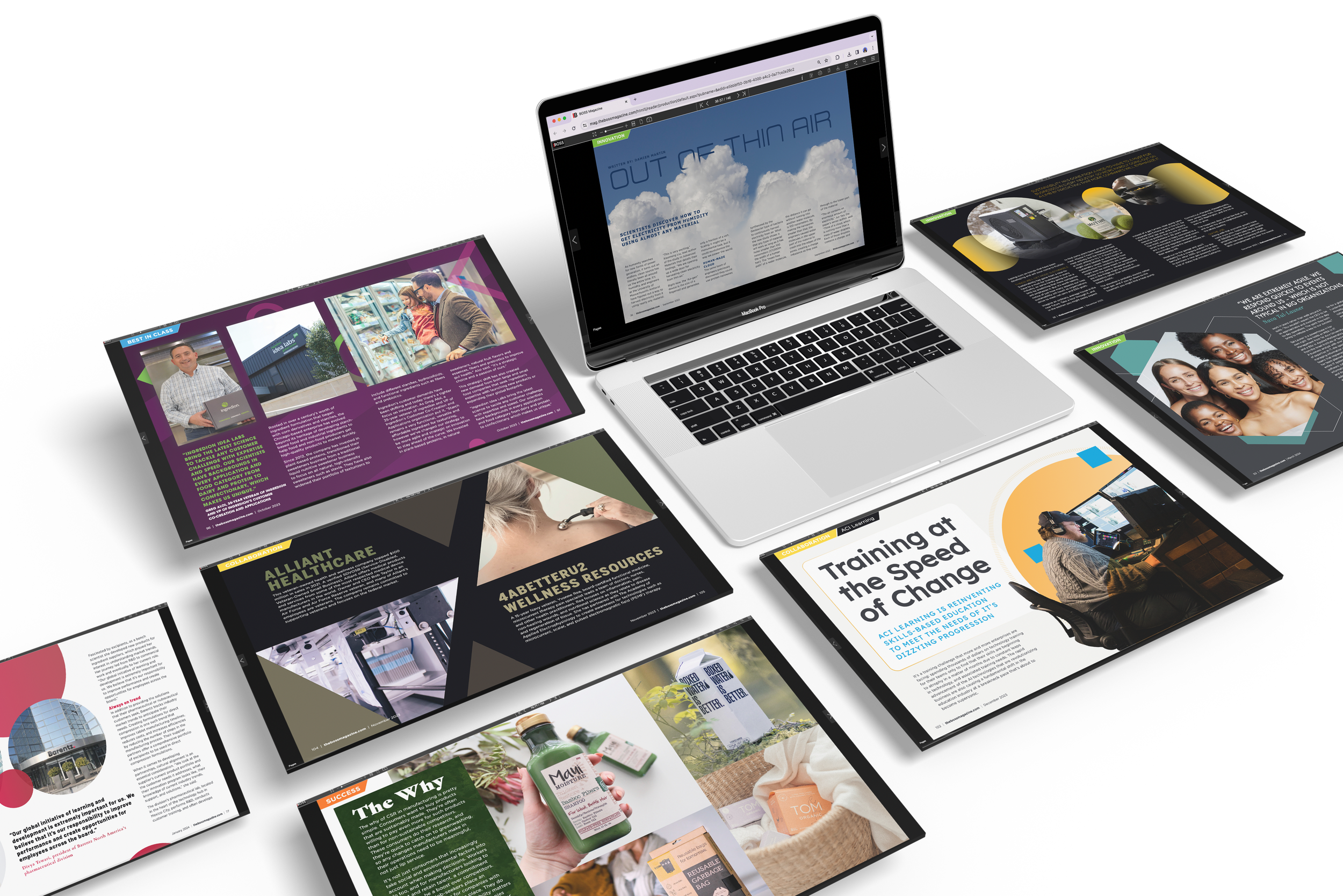
Boss Magazine, a publication that focuses on business leadership and industry insights, required an increase in engagement. The project entailed designing both digital and print layouts to enhance readability and capture the essence of the articles using typography and imagery. My goal was to create a more dynamic and professional look that would resonate with their high-level professional audience.
Project Overview
Tools
Role
Duration
Junior Designer
Monthly
Team
Editor
Damien Martin
Senior Designer
Kristen Marzelli
Art Director
Sherelle Ledue
Production Manager
Nicola Batchelor
Boss magazine was expanding its reach by featuring more global companies in larger magazine formats. To complement this growth, the magazine sought to revitalize its social media presence and offer comprehensive marketing services to both itself and the featured companies. Additionally, the goal was to refresh the monthly email newsletter and expand the audience through targeted marketing efforts.
Boss magazine aimed to expand its global reach and enhance its marketing efforts across social media, email newsletters, and company promotions.
The Problem
My Role
As the sole designer, I took charge of the designs from start to finish. This included initial concept development, layout creation, typography selection, and final execution of the print and digital editions. I collaborated with the editorial team and senior designers to ensure the design aligned with the publication’s content and branding goals.
I was responsible for the complete design, overseeing every phase from conceptualization to final delivery across digital and print platforms including social media.
I began with in-depth research to understand Boss Magazine’s audience and competitive landscape. I learned how to establish the grid structure and experimented with layouts that emphasized readability and visual hierarchy. After presenting initial concepts, I iterated based on feedback and delivered designs optimized for digital editorials and print assets.
My design process involved research, understanding the article content, getting inspiration, ensuring the design was user-centric and aligned with brand values.
Process
The redesign resulted in a visually cohesive layout that enhanced both the magazine’s professional tone and user engagement. I used a clean, grid-based structure with modern typography and a refined color palette. The new design improved the flow of content, making it easier for readers to engage with articles while maintaining a sophisticated look that matched the brand’s identity.
The final design featured a cohesive, modern aesthetic that improved user engagement and brand consistency.
The Solution
This project reinforced the importance of design consistency and the ability to adapt layouts for different formats.
What I Learned
Through this project, I gained valuable experience in balancing creative design with the functional requirements of a professional publication. I learned how to create layouts that are flexible enough for both print and digital formats while maintaining a consistent brand aesthetic. The project also strengthened my ability to work independently while ensuring that all elements served the business goals.
Testimonials
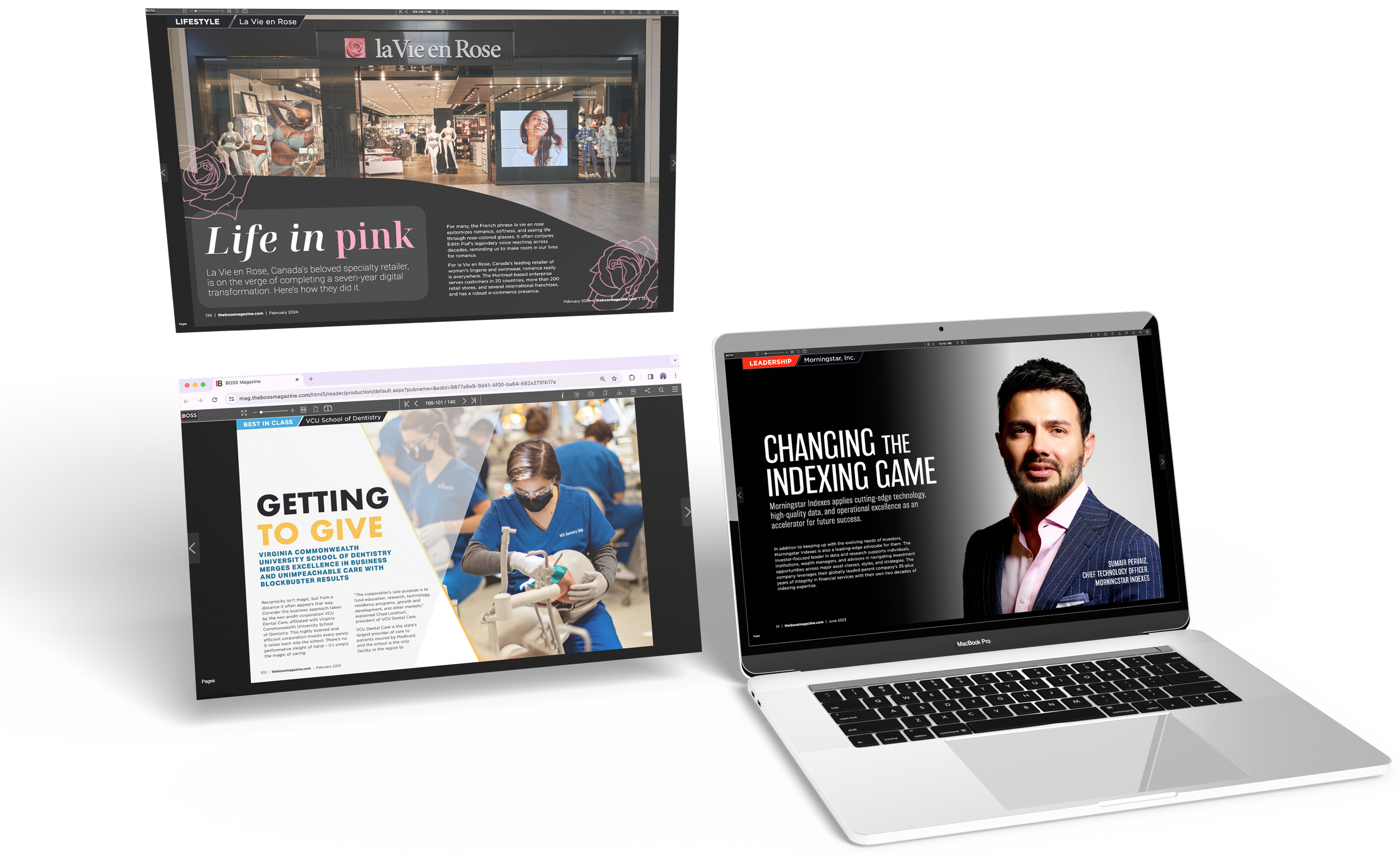
“The article looks amazing! We are very excited to know it’s now published!”
La Vie En Rose
“This looks great. Thanks so much for your patience and the effort it took creating everything.”
VCU School of Dentistry
“I absolutely love this feature & design that you have put together.”
Morningstar

